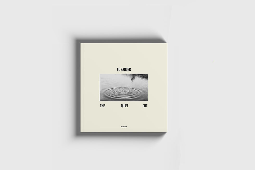
The Quiet
Cut


‘The Quiet Cut’ is a self-directed and my final project developed during my time at university. Inspired by the aesthetic and philosophy of Jil Sander, the project explored the concept of restraint and the language of minimalism, examining form, movement, light, texture and colour. The outcome was a 52-page hardback publication, entirely conceptualised, photographed, and graphically designed by myself, reflecting a thoughtful and refined visual narrative rooted in minimalist design principles.
Concept Brief
This 52-page hardback publication offers a considered exploration of Jil Sander’s enduring minimalist design language. Rooted in restraint and quiet elegance, the project distils five foundational pillars of the brand’s aesthetic: purity of form, fluid movement, the human figure, sculptural light, and a refined, understated colour palette. Every aspect of the publication, from concept to execution, reflects a deep understanding of Sander’s philosophy, translating it into a tactile and visually cohesive narrative. To accompany the launch, a curated event concept was developed alongside a suite of supporting social media assets, designed to amplify the project’s reach and reinforce the brand’s presence across digital platforms. Each element is meticulously aligned with Jil Sander’s visual identity, ensuring consistency, clarity, and a seamless extension of the brand’s narrative across both physical and digital spaces.
Project
Content
* 52 page printed publication
* Launch Event Deck
* Social Media Assets